Your graphics add a nice touch to my presentations and I recently used them for one of my all-hands meetings. Your toolbox adds professionalism to my slides. Instead of using standard clipart.
Claude Jones, Director of Engineer, @Walmartlabs, USA
Your graphics add a nice touch to my presentations and I recently used them for one of my all-hands meetings. Your toolbox adds professionalism to my slides. Instead of using standard clipart.
Claude Jones, Director of Engineer, @Walmartlabs, USA
I needed a fresh look at some of my slides. I've tried to find a way to create a paintbrush effect, to underline, accentuate, add some color and the handwritten markers were just the things. Very easy to use, easy to size, change the color. It was an affordable, perfect solution and I'm happy to recommend it.
Anonymous, US
The crisp, clean look of the graphics, and the fact that it allowed me to easily edit and change the colors to match the template was my main reason for purchasing them.
Brandie Jenkins, E-learning Developer, USA
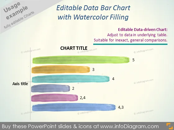
Die PowerPoint-Folie präsentiert ein "Bearbeitbares Daten-Balkendiagramm mit Aquarellfüllung" und betont seine Eignung für allgemeine, ungenaue Vergleiche. Sie hebt hervor, dass das Diagramm datengestützt ist und basierend auf den Daten in der zugrunde liegenden Tabelle angepasst werden kann. Jeder Balken repräsentiert einen Wert, mit Zahlen wie 2, 3 und 5, die unterschiedliche Datenpunkte suggerieren, die wahrscheinlich mit verschiedenen Kategorien oder Zeiträumen korrelieren.
Die Folie hat ein künstlerisches Flair durch die Balken im Aquarelleffekt, was dem Diagramm ein zugängliches, unkonventionelles Aussehen verleiht. Der Text und die Platzhalter sind minimal, um sicherzustellen, dass der Fokus auf der stilisierten Datenrepräsentation bleibt.


