Your graphics add a nice touch to my presentations and I recently used them for one of my all-hands meetings. Your toolbox adds professionalism to my slides. Instead of using standard clipart.
Claude Jones, Director of Engineer, @Walmartlabs, USA
Your graphics add a nice touch to my presentations and I recently used them for one of my all-hands meetings. Your toolbox adds professionalism to my slides. Instead of using standard clipart.
Claude Jones, Director of Engineer, @Walmartlabs, USA
I needed a fresh look at some of my slides. I've tried to find a way to create a paintbrush effect, to underline, accentuate, add some color and the handwritten markers were just the things. Very easy to use, easy to size, change the color. It was an affordable, perfect solution and I'm happy to recommend it.
Anonymous, US
The crisp, clean look of the graphics, and the fact that it allowed me to easily edit and change the colors to match the template was my main reason for purchasing them.
Brandie Jenkins, E-learning Developer, USA
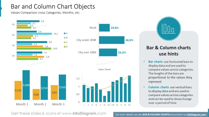
Die Folie mit dem Titel "Balken- und Säulendiagramm-Objekte" behandelt, wie Balken- und Säulendiagramme verwendet werden, um Werte über Kategorien, Monate und andere Variablen zu vergleichen. Sie enthält Beispiele für beide Diagrammtypen: Balkendiagramme werden mit horizontalen Balken gezeigt, die verschiedene Kategorien wie "Stadt unter 200K" mit Prozentangaben darstellen, während Säulendiagramme vertikale Balken verwenden, die unten monetäre Werte über drei Monate darstellen und einen Verkaufstrend über zwölf Monate zeigen, wobei vertikale Balken mit einer gestrichelten Linie verbunden sind, die die oberen Punkte miteinander verbindet, um den Trend anzuzeigen.
Die visuelle Komposition besteht aus klaren Linien, gut strukturierten Grafiken und einem Farbcodesystem für eine einfache Interpretation. Sie kombiniert effektiv Text und grafische Elemente, um Datentechniken zur Vergleichsanalyse mit Balken- und Säulendiagrammen zu veranschaulichen.


