

Your graphics add a nice touch to my presentations and I recently used them for one of my all-hands meetings. Your toolbox adds professionalism to my slides. Instead of using standard clipart.
Claude Jones, Director of Engineer, @Walmartlabs, USA

Your graphics add a nice touch to my presentations and I recently used them for one of my all-hands meetings. Your toolbox adds professionalism to my slides. Instead of using standard clipart.
Claude Jones, Director of Engineer, @Walmartlabs, USA
I needed a fresh look at some of my slides. I've tried to find a way to create a paintbrush effect, to underline, accentuate, add some color and the handwritten markers were just the things. Very easy to use, easy to size, change the color. It was an affordable, perfect solution and I'm happy to recommend it.
Anonymous, US
The crisp, clean look of the graphics, and the fact that it allowed me to easily edit and change the colors to match the template was my main reason for purchasing them.
Brandie Jenkins, E-learning Developer, USA
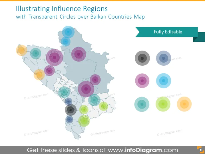
Die PowerPoint-Folie bietet eine grafische Darstellung von Einflussregionen unter Verwendung von transparenten farbigen Kreisen, die auf einer Karte der Balkanländer überlagert sind. Diese Visualisierungstechnik wird angewendet, um unterschiedliche Einflussgrade, Interessen oder Präsenz in verschiedenen geografischen Regionen zu betonen. Die Folie zeigt, dass das Konzept darauf abzielt, eine visuelle Darstellung zu bieten, um das geografische Verteilungsmuster von Einfluss zu erleichtern und mögliche Überschneidungen aufgrund der Überlagerung der Kreise darzustellen.
Die Folie hat ein ausgewogenes und klares Layout, das den Schwerpunkt auf die visuelle Darstellung legt, wobei Farbe und Transparenz genutzt werden, um zwischen Regionen zu unterscheiden. Sie kombiniert effektiv Grafiken und Text, um ihre Botschaft zu vermitteln.



