Your graphics add a nice touch to my presentations and I recently used them for one of my all-hands meetings. Your toolbox adds professionalism to my slides. Instead of using standard clipart.
Claude Jones, Director of Engineer, @Walmartlabs, USA
Your graphics add a nice touch to my presentations and I recently used them for one of my all-hands meetings. Your toolbox adds professionalism to my slides. Instead of using standard clipart.
Claude Jones, Director of Engineer, @Walmartlabs, USA
I needed a fresh look at some of my slides. I've tried to find a way to create a paintbrush effect, to underline, accentuate, add some color and the handwritten markers were just the things. Very easy to use, easy to size, change the color. It was an affordable, perfect solution and I'm happy to recommend it.
Anonymous, US
The crisp, clean look of the graphics, and the fact that it allowed me to easily edit and change the colors to match the template was my main reason for purchasing them.
Brandie Jenkins, E-learning Developer, USA
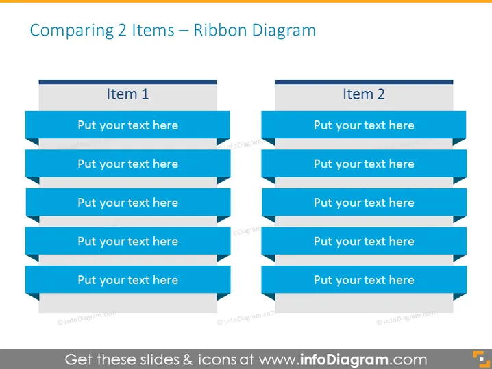
Diese Folie dient dem Vergleich von zwei Elementen oder Konzepten und nutzt ein Banddiagramm zur Präsentation der Informationen. "Element 1" und "Element 2" sind als Überschriften für jede Spalte positioniert und deuten auf einen Vergleich zwischen ihnen hin. Unter jeder Überschrift befinden sich fünf blaue Bandbanner, in die erläuternder Text eingefügt werden kann. Diese Bänder bieten eine strukturierte Möglichkeit, verschiedene Aspekte oder Funktionen der beiden Elemente darzustellen und fördern einen leicht nachvollziehbaren visuellen Vergleich.
Die Folie verwendet ein klares, professionelles Design mit einem Fokus auf kontrastierende Farben, die den Inhalt hervorheben. Ihr strukturiertes Layout bietet eine unkomplizierte Möglichkeit für das Publikum, die verglichenen Informationen zu assimilieren.


