Your graphics add a nice touch to my presentations and I recently used them for one of my all-hands meetings. Your toolbox adds professionalism to my slides. Instead of using standard clipart.
Claude Jones, Director of Engineer, @Walmartlabs, USA
Your graphics add a nice touch to my presentations and I recently used them for one of my all-hands meetings. Your toolbox adds professionalism to my slides. Instead of using standard clipart.
Claude Jones, Director of Engineer, @Walmartlabs, USA
I needed a fresh look at some of my slides. I've tried to find a way to create a paintbrush effect, to underline, accentuate, add some color and the handwritten markers were just the things. Very easy to use, easy to size, change the color. It was an affordable, perfect solution and I'm happy to recommend it.
Anonymous, US
The crisp, clean look of the graphics, and the fact that it allowed me to easily edit and change the colors to match the template was my main reason for purchasing them.
Brandie Jenkins, E-learning Developer, USA
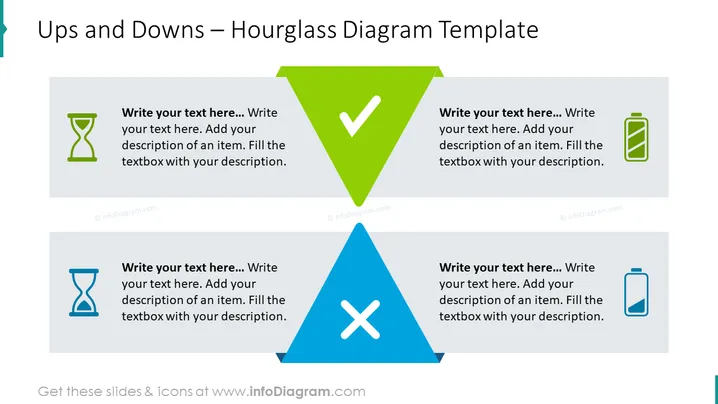
##Hochs und Tiefs - Sanduhr-Diagramm Folieninhalt Das Hochs und Tiefs - Sanduhr-Diagramm wird verwendet, um die positiven und negativen Ergebnisse, die in einem bestimmten Zeitraum aufgetreten sind, zu visualisieren und zu analysieren. Es ermöglicht Ihnen, Ihre Folie auf eine klare und visuell ansprechende Weise zu präsentieren, wobei Grafiken und Farben verwendet werden, um Schlüsselaspekte hervorzuheben und die Informationen leichter verständlich zu machen. Alle Formen sind Vektoren, sodass Sie mit den Farben spielen und die Elemente ohne Qualitätsverlust in der Größe ändern können. Sie können diese PPT-Vorlage auf Google Slides und Keynote herunterladen. ##Hochs und Tiefs - Sanduhr-Diagramm Folieninfografiken Weißer Hintergrund, Textfeld, Sanduhr-Icon, Batterie-Icon, Geladenes Icon, Ungeladenes Icon


