Your graphics add a nice touch to my presentations and I recently used them for one of my all-hands meetings. Your toolbox adds professionalism to my slides. Instead of using standard clipart.
Claude Jones, Director of Engineer, @Walmartlabs, USA
Your graphics add a nice touch to my presentations and I recently used them for one of my all-hands meetings. Your toolbox adds professionalism to my slides. Instead of using standard clipart.
Claude Jones, Director of Engineer, @Walmartlabs, USA
I needed a fresh look at some of my slides. I've tried to find a way to create a paintbrush effect, to underline, accentuate, add some color and the handwritten markers were just the things. Very easy to use, easy to size, change the color. It was an affordable, perfect solution and I'm happy to recommend it.
Anonymous, US
The crisp, clean look of the graphics, and the fact that it allowed me to easily edit and change the colors to match the template was my main reason for purchasing them.
Brandie Jenkins, E-learning Developer, USA
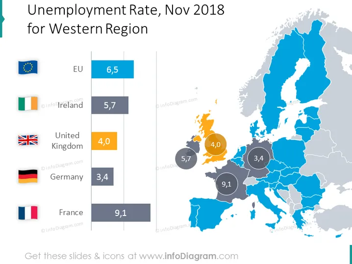
Die PowerPoint-Folie präsentiert die Arbeitslosenquoten für verschiedene Regionen in Westeuropa für November 2018. Der Durchschnitt der Europäischen Union wird mit 6,5 % angezeigt, Irland hat 5,7 %, das Vereinigte Königreich 4,0 %, Deutschland 3,4 % und Frankreich mit 9,1 % einen erheblich höheren Wert. Die Arbeitslosenquote jedes Landes ist mit seiner Flagge verbunden, was einen visuellen Bezug zu den Daten des Landes bietet.
Die Folie hat eine saubere und moderne Ästhetik, mit klarem visuellen Schwerpunkt auf der Datenpräsentation. Die Verwendung von Flaggen und einer Karte ist eine effektive Möglichkeit, Daten mit Geografie zu verknüpfen.


