Your graphics add a nice touch to my presentations and I recently used them for one of my all-hands meetings. Your toolbox adds professionalism to my slides. Instead of using standard clipart.
Claude Jones, Director of Engineer, @Walmartlabs, USA
Your graphics add a nice touch to my presentations and I recently used them for one of my all-hands meetings. Your toolbox adds professionalism to my slides. Instead of using standard clipart.
Claude Jones, Director of Engineer, @Walmartlabs, USA
I needed a fresh look at some of my slides. I've tried to find a way to create a paintbrush effect, to underline, accentuate, add some color and the handwritten markers were just the things. Very easy to use, easy to size, change the color. It was an affordable, perfect solution and I'm happy to recommend it.
Anonymous, US
The crisp, clean look of the graphics, and the fact that it allowed me to easily edit and change the colors to match the template was my main reason for purchasing them.
Brandie Jenkins, E-learning Developer, USA
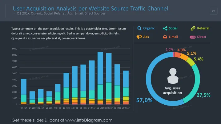
Die Folie präsentiert eine Analyse der Benutzerakquise über verschiedene Verkehrskanäle wie organische Suche, soziale Medien, Empfehlungen, Werbung, E-Mails und direkte Quellen für das erste Quartal eines nicht näher benannten Jahres. Es gibt ein Balkendiagramm, das die Benutzerakquise über mehrere Wochen zeigt, wobei jeder Balken intuitiv aufgeteilt ist, um die Beiträge aus verschiedenen Kanälen widerzuspiegeln. Die Folie enthält auch ein kreisförmiges Infografik-Element, das die durchschnittlichen Benutzerakquisitionsprozentsätze nach diesen Kanälen darstellt. Ein Platzhaltertextfeld ermutigt den Präsentationsdesigner, Kommentare zu den gezeigten Ergebnissen abzugeben.
Die Folie hat ein professionelles und poliertes Aussehen, verwendet ein dunkles Thema, das die Lebendigkeit der farbcodierten Diagramme erhöht. Die aufschlussreiche Nutzung grafischer Elemente bietet eine klare visuelle Darstellung komplexer Daten.


