Your graphics add a nice touch to my presentations and I recently used them for one of my all-hands meetings. Your toolbox adds professionalism to my slides. Instead of using standard clipart.
Claude Jones, Director of Engineer, @Walmartlabs, USA
Your graphics add a nice touch to my presentations and I recently used them for one of my all-hands meetings. Your toolbox adds professionalism to my slides. Instead of using standard clipart.
Claude Jones, Director of Engineer, @Walmartlabs, USA
I needed a fresh look at some of my slides. I've tried to find a way to create a paintbrush effect, to underline, accentuate, add some color and the handwritten markers were just the things. Very easy to use, easy to size, change the color. It was an affordable, perfect solution and I'm happy to recommend it.
Anonymous, US
The crisp, clean look of the graphics, and the fact that it allowed me to easily edit and change the colors to match the template was my main reason for purchasing them.
Brandie Jenkins, E-learning Developer, USA
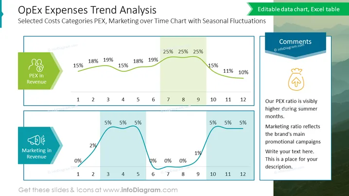
Die Folie präsentiert eine Trendanalyse der Betriebsausgaben (OpEx) mit einem Schwerpunkt auf ausgewählten Kostenkategorien wie PEX und Marketing über einen Zeitraum von 12 Monaten, der saisonale Schwankungen zeigt. Zwei Liniendiagramme heben den Prozentsatz von PEX und Marketing am Umsatz hervor, mit strategischen Punkten im Laufe des Jahres, die höhere Prozentsätze in bestimmten Monaten anzeigen. Zum Beispiel steigen die PEX-Ausgaben in den Monaten 4-6, während die Marketing-Ausgaben in den Monaten 7-9 ihren Höhepunkt erreichen. Ein Kommentarfeld deutet darauf hin, dass das PEX-Verhältnis in den Sommermonaten höher ist und dass das Marketingverhältnis mit den Hauptwerbeaktionen übereinstimmt.


