Your graphics add a nice touch to my presentations and I recently used them for one of my all-hands meetings. Your toolbox adds professionalism to my slides. Instead of using standard clipart.
Claude Jones, Director of Engineer, @Walmartlabs, USA
Your graphics add a nice touch to my presentations and I recently used them for one of my all-hands meetings. Your toolbox adds professionalism to my slides. Instead of using standard clipart.
Claude Jones, Director of Engineer, @Walmartlabs, USA
I needed a fresh look at some of my slides. I've tried to find a way to create a paintbrush effect, to underline, accentuate, add some color and the handwritten markers were just the things. Very easy to use, easy to size, change the color. It was an affordable, perfect solution and I'm happy to recommend it.
Anonymous, US
The crisp, clean look of the graphics, and the fact that it allowed me to easily edit and change the colors to match the template was my main reason for purchasing them.
Brandie Jenkins, E-learning Developer, USA
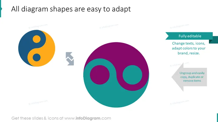
Die Folie soll die einfache Anpassung von Diagrammen und Symbolen in einem Präsentationstool wie PowerPoint verdeutlichen. Sie enthält zwei farbenfrohe grafische Darstellungen – ein Yin-Yang-Symbol und ein Venn-Diagramm – mit einem Pfeil, der vom ersten zum zweiten führt und den Transformations- oder Anpassungsprozess symbolisiert. Textfelder, die die Bearbeitbarkeit der Diagrammelemente betonen, legen nahe, dass Benutzer Texte, Symbole ändern, Farben an ihr Branding anpassen, Elemente ändern, gruppieren, kopieren, duplizieren oder entfernen können. Jedes Konzept bezieht sich auf Anpassungsoptionen: Texte und Symbole ändern, Farbschemata an das Unternehmensbranding anpassen, Elemente für verschiedene Layouts ändern und einzelne Komponenten des Diagramms für Flexibilität verwalten.
Die Folie weist ein sauberes Design mit kräftigen Farben und minimalem Text auf. Der Einsatz von Richtungssymbolen und kontrastierenden Farben macht die Transformationsbotschaft klar und visuell ansprechend.


