

Your graphics add a nice touch to my presentations and I recently used them for one of my all-hands meetings. Your toolbox adds professionalism to my slides. Instead of using standard clipart.
Claude Jones, Director of Engineer, @Walmartlabs, USA

Your graphics add a nice touch to my presentations and I recently used them for one of my all-hands meetings. Your toolbox adds professionalism to my slides. Instead of using standard clipart.
Claude Jones, Director of Engineer, @Walmartlabs, USA
I needed a fresh look at some of my slides. I've tried to find a way to create a paintbrush effect, to underline, accentuate, add some color and the handwritten markers were just the things. Very easy to use, easy to size, change the color. It was an affordable, perfect solution and I'm happy to recommend it.
Anonymous, US
The crisp, clean look of the graphics, and the fact that it allowed me to easily edit and change the colors to match the template was my main reason for purchasing them.
Brandie Jenkins, E-learning Developer, USA
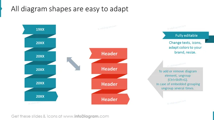
Die Folie zeigt, wie Diagrammformen in PowerPoint leicht an unterschiedliche Bedürfnisse angepasst werden können. Sie demonstriert die Anpassungsfähigkeit von Elementen, indem sie zwei Gruppen von Formen vergleicht: eine Reihe von türkisfarbenen Bandbannern mit Jahren, die von '19XX' bis '20XX' beschriftet sind, und übergeht zu roten Parallelogrammformen mit dem Wort "Header." Erklärungen neben den Formen weisen darauf hin, dass diese "Vollständig editierbar" sind, was Text-, Icon-, Farb- und Größenänderungen ermöglicht, und auch gruppiert werden können, um eine einfache Manipulation zu ermöglichen.
Die Folie hat ein professionelles und lehrreiches Design mit einem klaren visuellen Kontrast zwischen "vorher" (türkise Bannerformen) und "nachher" (rote Parallelogrammformen). Der lehrreiche Text ergänzt die visuellen Elemente und bietet einen direkten Leitfaden, wie man Diagrammformen anpasst.



