Your graphics add a nice touch to my presentations and I recently used them for one of my all-hands meetings. Your toolbox adds professionalism to my slides. Instead of using standard clipart.
Claude Jones, Director of Engineer, @Walmartlabs, USA
Your graphics add a nice touch to my presentations and I recently used them for one of my all-hands meetings. Your toolbox adds professionalism to my slides. Instead of using standard clipart.
Claude Jones, Director of Engineer, @Walmartlabs, USA
I needed a fresh look at some of my slides. I've tried to find a way to create a paintbrush effect, to underline, accentuate, add some color and the handwritten markers were just the things. Very easy to use, easy to size, change the color. It was an affordable, perfect solution and I'm happy to recommend it.
Anonymous, US
The crisp, clean look of the graphics, and the fact that it allowed me to easily edit and change the colors to match the template was my main reason for purchasing them.
Brandie Jenkins, E-learning Developer, USA
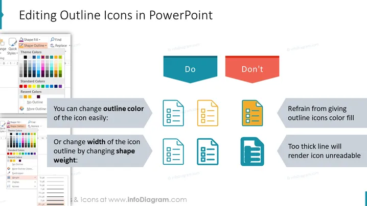
Die Folie erklärt, wie man Umrisssymbole in PowerPoint richtig bearbeitet. Sie schlägt vor, dass Benutzer die Umrissfarbe der Symbole einfach ändern und die Breite des Symbolumrisses durch Ändern des Formgewichts anpassen sollten. Die Konzepte von "Do" und "Don't" werden durch Beispiele veranschaulicht: Für "Do" werden Symbole mit unterschiedlichen Umrissfarben und -dicken gezeigt, was die Anpassung demonstriert; für "Don't" ist ein Symbol farbig ausgefüllt, was es unleserlich macht, und ein anderes wird mit einer übermäßig dicken Linie dargestellt, was auf eine schlechte Lesbarkeit hinweist.
Die Folie verwendet eine Kombination aus flachem Design für die Symbole und Screenshots sowie kontrastierenden Farben, um zwischen empfohlenen Praktiken und häufigen Fehlern zu unterscheiden. Cleverer Einsatz von Pfeilen schafft einen klaren visuellen Weg vom Problem zur Lösung.


