

Your graphics add a nice touch to my presentations and I recently used them for one of my all-hands meetings. Your toolbox adds professionalism to my slides. Instead of using standard clipart.
Claude Jones, Director of Engineer, @Walmartlabs, USA

Your graphics add a nice touch to my presentations and I recently used them for one of my all-hands meetings. Your toolbox adds professionalism to my slides. Instead of using standard clipart.
Claude Jones, Director of Engineer, @Walmartlabs, USA
I needed a fresh look at some of my slides. I've tried to find a way to create a paintbrush effect, to underline, accentuate, add some color and the handwritten markers were just the things. Very easy to use, easy to size, change the color. It was an affordable, perfect solution and I'm happy to recommend it.
Anonymous, US
The crisp, clean look of the graphics, and the fact that it allowed me to easily edit and change the colors to match the template was my main reason for purchasing them.
Brandie Jenkins, E-learning Developer, USA
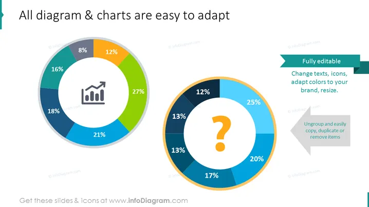
Die PowerPoint-Folie veranschaulicht die Anpassungsfähigkeit von Diagrammen und Grafiken und zeigt zwei bearbeitbare Kreisdiagramme mit unterschiedlichen Prozentsätzen. 8 %, 12 %, 16 %, 18 % und 21 % Segmente werden im linken Diagramm dargestellt, das ein Symbol enthält, das einen Aufwärtstrend in einem seiner Abschnitte zeigt und ein Element von Wachstum oder Erfolg andeutet. Das rechte Diagramm zeigt Segmente, die mit 12 %, 13 % (drei Abschnitte), 17 %, 20 % und 25 % beschriftet sind und in dessen Mitte sich ein Fragezeichensymbol befindet, das auf einen unbekannten oder noch festzulegenden Faktor hinweist.
Die Folie verwendet ein sauberes und modernes Design. Der Einsatz von Farbcode und einfachen Symbolen kommuniziert effektiv die Idee einer anpassbaren Datenpräsentation.



