

Your graphics add a nice touch to my presentations and I recently used them for one of my all-hands meetings. Your toolbox adds professionalism to my slides. Instead of using standard clipart.
Claude Jones, Director of Engineer, @Walmartlabs, USA

Your graphics add a nice touch to my presentations and I recently used them for one of my all-hands meetings. Your toolbox adds professionalism to my slides. Instead of using standard clipart.
Claude Jones, Director of Engineer, @Walmartlabs, USA
I needed a fresh look at some of my slides. I've tried to find a way to create a paintbrush effect, to underline, accentuate, add some color and the handwritten markers were just the things. Very easy to use, easy to size, change the color. It was an affordable, perfect solution and I'm happy to recommend it.
Anonymous, US
The crisp, clean look of the graphics, and the fact that it allowed me to easily edit and change the colors to match the template was my main reason for purchasing them.
Brandie Jenkins, E-learning Developer, USA
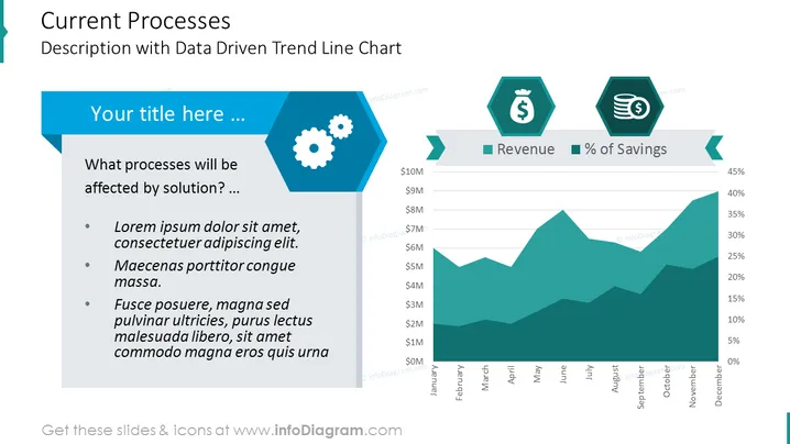
Die PowerPoint-Folie ist so gestaltet, dass sie eine detaillierte Analyse der aktuellen Prozesse bietet, mit einem Fokus auf Trends über die Zeit, wie durch ein Trendlinien-Diagramm angezeigt. Der Titel deutet auf eine Diskussion über Prozesse hin, die von einer neuen Lösung betroffen sind, und die Aufzählungspunkte bieten eine Struktur zur Präsentation von Problemen, vorgeschlagenen Lösungen und erwarteten Vorteilen. Das Trendlinien-Diagramm, mit dualen Indikatoren für Einnahmen und Einsparungsprozentsätze, bietet eine visuelle Darstellung der finanziellen Performance über ein Jahr.
Das Gesamtdesign verwendet eine professionelle Farbpalette aus Blau- und Grüntönen, die ein Unternehmensgefühl schafft. Die sechseckigen Formen fügen eine moderne geometrische Note hinzu, während das Diagramm eine klare visuelle Darstellung der Datentrends bietet.



