Your graphics add a nice touch to my presentations and I recently used them for one of my all-hands meetings. Your toolbox adds professionalism to my slides. Instead of using standard clipart.
Claude Jones, Director of Engineer, @Walmartlabs, USA
Your graphics add a nice touch to my presentations and I recently used them for one of my all-hands meetings. Your toolbox adds professionalism to my slides. Instead of using standard clipart.
Claude Jones, Director of Engineer, @Walmartlabs, USA
I needed a fresh look at some of my slides. I've tried to find a way to create a paintbrush effect, to underline, accentuate, add some color and the handwritten markers were just the things. Very easy to use, easy to size, change the color. It was an affordable, perfect solution and I'm happy to recommend it.
Anonymous, US
The crisp, clean look of the graphics, and the fact that it allowed me to easily edit and change the colors to match the template was my main reason for purchasing them.
Brandie Jenkins, E-learning Developer, USA
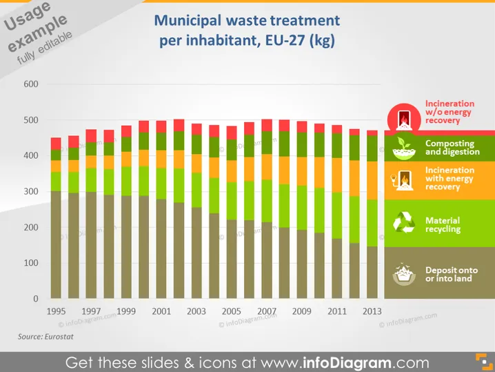
Die Folie präsentiert Daten zur kommunalen Abfallbehandlung pro Einwohner innerhalb der EU-27, gemessen in Kilogramm. Der Inhalt zeigt ein gestapeltes Säulendiagramm für die Jahre von 1995 bis 2013. Jede Säule repräsentiert ein Jahr und ist in fünf Abschnitte unterteilt, die jeweils unterschiedliche Abfallbehandlungsprozesse anzeigen: Verbrennung ohne Energieerzeugung, Kompostierung und Vergärung, Verbrennung mit Energieerzeugung, Materialrecycling und Deponierung auf oder in Land. Die Farben und Größen der Abschnitte ändern sich über die Jahre und spiegeln Veränderungen in den Abfallbewirtschaftungspraktiken wider.
Die Folie hat ein professionelles und sauberes Design mit einer klaren visuellen Darstellung der Daten durch den Einsatz von Farbcodes und Symbolen. Der Kontrast zwischen den Farben und die strukturierte Anordnung der Elemente erleichtern das Verständnis der Informationen.


