Your graphics add a nice touch to my presentations and I recently used them for one of my all-hands meetings. Your toolbox adds professionalism to my slides. Instead of using standard clipart.
Claude Jones, Director of Engineer, @Walmartlabs, USA
Your graphics add a nice touch to my presentations and I recently used them for one of my all-hands meetings. Your toolbox adds professionalism to my slides. Instead of using standard clipart.
Claude Jones, Director of Engineer, @Walmartlabs, USA
I needed a fresh look at some of my slides. I've tried to find a way to create a paintbrush effect, to underline, accentuate, add some color and the handwritten markers were just the things. Very easy to use, easy to size, change the color. It was an affordable, perfect solution and I'm happy to recommend it.
Anonymous, US
The crisp, clean look of the graphics, and the fact that it allowed me to easily edit and change the colors to match the template was my main reason for purchasing them.
Brandie Jenkins, E-learning Developer, USA
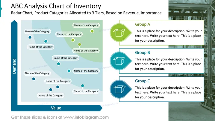
Die Folie präsentiert ein "ABC-Analyse-Diagramm des Inventars", das die Verteilung der Produktkategorien über drei Stufen hinweg veranschaulicht, die ihre Bedeutung basierend auf Umsatz und Nachfrage signifiziert. Das Radar-Diagramm in der Mitte sortiert die Kategorien nach ihrer Nachfrage und ihrem Wert auf sich schneidenden Achsen. Auf der rechten Seite befinden sich Platzhalter für Beschreibungen der drei Gruppen, die mit A, B und C gekennzeichnet sind, die unterschiedlichen Ebenen von Bedeutung oder Umsatz innerhalb des Inventarklassifizierungssystems entsprechen.
Die Folie hat ein klares und professionelles visuelles Design, mit strategischem Einsatz von Farben, die zwischen Text, Grafikelementen und Hintergrund unterscheiden. Der Einsatz eines Radar-Diagramms neben beschreibenden Kästen bietet eine visuelle und textuelle Möglichkeit, komplexe Daten darzustellen.


