Your graphics add a nice touch to my presentations and I recently used them for one of my all-hands meetings. Your toolbox adds professionalism to my slides. Instead of using standard clipart.
Claude Jones, Director of Engineer, @Walmartlabs, USA
Your graphics add a nice touch to my presentations and I recently used them for one of my all-hands meetings. Your toolbox adds professionalism to my slides. Instead of using standard clipart.
Claude Jones, Director of Engineer, @Walmartlabs, USA
I needed a fresh look at some of my slides. I've tried to find a way to create a paintbrush effect, to underline, accentuate, add some color and the handwritten markers were just the things. Very easy to use, easy to size, change the color. It was an affordable, perfect solution and I'm happy to recommend it.
Anonymous, US
The crisp, clean look of the graphics, and the fact that it allowed me to easily edit and change the colors to match the template was my main reason for purchasing them.
Brandie Jenkins, E-learning Developer, USA
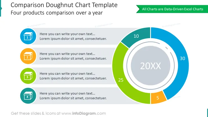
Die Folie trägt den Titel "Vergleichs-Doughnut-Diagramm-Vorlage" und den Untertitel "Vergleich von vier Produkten über ein Jahr." Sie zeigt auf der rechten Seite eine Grafik eines Doughnut-Diagramms mit Platzhaltern für Prozentsätze, die den Anteil jedes Artikels darstellen. Vier farbige Icons auf der linken Seite entsprechen den Segmenten des Doughnut-Diagramms, jedes mit einem Platzhaltertext, der zeigt, wo Nutzer ihre eigenen Beschreibungen eintragen können. Jede dieser Erklärungen stellt ein anderes Produkt oder eine Kategorie zum Vergleich dar.
Die gesamte visuelle Komposition der Folie ist harmonisch und ausgewogen, mit einer klaren Trennung zwischen den textlichen Informationen auf der linken Seite und der grafischen Datenpräsentation auf der rechten Seite.


