Your graphics add a nice touch to my presentations and I recently used them for one of my all-hands meetings. Your toolbox adds professionalism to my slides. Instead of using standard clipart.
Claude Jones, Director of Engineer, @Walmartlabs, USA
Your graphics add a nice touch to my presentations and I recently used them for one of my all-hands meetings. Your toolbox adds professionalism to my slides. Instead of using standard clipart.
Claude Jones, Director of Engineer, @Walmartlabs, USA
I needed a fresh look at some of my slides. I've tried to find a way to create a paintbrush effect, to underline, accentuate, add some color and the handwritten markers were just the things. Very easy to use, easy to size, change the color. It was an affordable, perfect solution and I'm happy to recommend it.
Anonymous, US
The crisp, clean look of the graphics, and the fact that it allowed me to easily edit and change the colors to match the template was my main reason for purchasing them.
Brandie Jenkins, E-learning Developer, USA
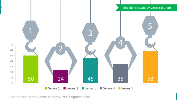
Die PowerPoint-Folie präsentiert ein datenbasiertes Diagramm, das fünf verschiedene Datenreihen zeigt, die durch Hebehaken mit angehängten Balken repräsentiert sind, die numerische Werte anzeigen. Jeder Haken ist mit einer Nummer beschriftet, die einer Reihe entspricht, und die Balken sind farblich kodiert, um zwischen den Reihen zu unterscheiden. Reihe 1 hat einen Wert von 50, Reihe 2 zeigt 24, Reihe 3 liegt bei 45, Reihe 4 steht bei 35, und Reihe 5 hat den höchsten Wert von 58.
Das Gesamtbild der Folie ist minimalistisch und modern, mit einer kreativen Interpretation der Daten durch Kranausleger und Balken. Die Farben sind lebendig und klar, was es einfach macht, zwischen den Datenreihen zu unterscheiden.


