
Your graphics add a nice touch to my presentations and I recently used them for one of my all-hands meetings. Your toolbox adds professionalism to my slides. Instead of using standard clipart.
Claude Jones, Director of Engineer, @Walmartlabs, USA
Your graphics add a nice touch to my presentations and I recently used them for one of my all-hands meetings. Your toolbox adds professionalism to my slides. Instead of using standard clipart.
Claude Jones, Director of Engineer, @Walmartlabs, USA
I needed a fresh look at some of my slides. I've tried to find a way to create a paintbrush effect, to underline, accentuate, add some color and the handwritten markers were just the things. Very easy to use, easy to size, change the color. It was an affordable, perfect solution and I'm happy to recommend it.
Anonymous, US
The crisp, clean look of the graphics, and the fact that it allowed me to easily edit and change the colors to match the template was my main reason for purchasing them.
Brandie Jenkins, E-learning Developer, USA
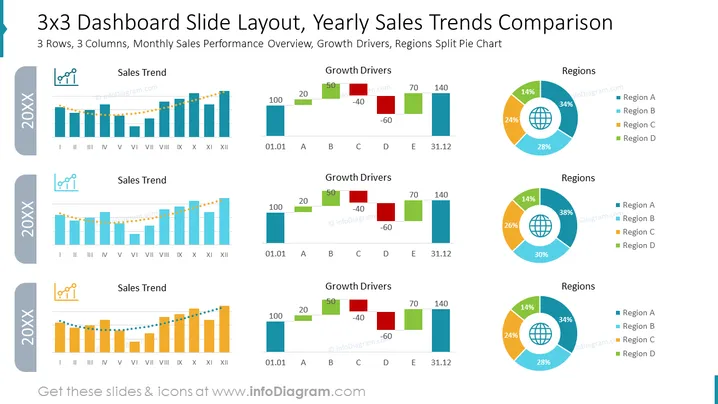
Die Folie ist eine Visualisierung der jährlichen Verkaufsperformance, mit neun Abschnitten, die in 3 Reihen und 3 Spalten angeordnet sind. Jede Reihe entspricht einem Jahr, wie auf der linken Seite mit '20XX' angezeigt. Die erste Spalte zeigt 'Verkaufstrend' mit einem Balkendiagramm, das die monatlichen Verkäufe verfolgt, und einer gestrichelten Linie, die den Trend über ein Jahr darstellt. Die Spalte 'Wachstumstreiber' zeigt ein Wasserfalldiagramm, das positive und negative Auswirkungen auf die Verkaufszahlen für spezifische Kategorien darstellt, die von A bis E bezeichnet sind. Die letzte Spalte präsentiert ein Tortendiagramm der 'Regionen', das die Verkaufsprozentsätze unter vier Regionen: A, B, C und D aufteilt. Jedes Konzept bietet eine Analyseebene - der Trend zeigt die allgemeine Leistung, Treiber geben Einflussfaktoren an, und Regionen heben die geografische Vertriebsverteilung hervor.
Die Folie verwendet eine Kombination aus lebhaften Farben und klaren visuellen Elementen, um komplexe Daten effizient darzustellen. Das Design ist sauber, mit ausreichend weißem Raum, der sicherstellt, dass die Grafiken und Daten leicht verständlich sind.




