Your graphics add a nice touch to my presentations and I recently used them for one of my all-hands meetings. Your toolbox adds professionalism to my slides. Instead of using standard clipart.
Claude Jones, Director of Engineer, @Walmartlabs, USA
Your graphics add a nice touch to my presentations and I recently used them for one of my all-hands meetings. Your toolbox adds professionalism to my slides. Instead of using standard clipart.
Claude Jones, Director of Engineer, @Walmartlabs, USA
I needed a fresh look at some of my slides. I've tried to find a way to create a paintbrush effect, to underline, accentuate, add some color and the handwritten markers were just the things. Very easy to use, easy to size, change the color. It was an affordable, perfect solution and I'm happy to recommend it.
Anonymous, US
The crisp, clean look of the graphics, and the fact that it allowed me to easily edit and change the colors to match the template was my main reason for purchasing them.
Brandie Jenkins, E-learning Developer, USA
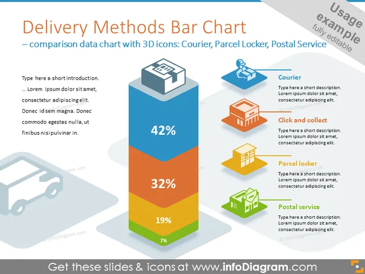
Die Folie trägt den Titel "Diagramm der Liefermethoden – Vergleichsdaten-Diagramm mit 3D-Symbolen: Kurier, Paketkasten, Postdienst." Sie präsentiert ein farbenfrohes vertikales Säulendiagramm mit vier Segmenten, die verschiedene Liefermethoden anzeigen: Kurier (42 %), Abholung (32 %), Paketkasten (19 %) und Postdienst (7 %). Jede Methode entspricht einem Prozentsatz, was eine Rangordnung oder Präferenzrate unter ihnen suggeriert. Der Kurier wird als der am häufigsten genutzte Dienst dargestellt, während der Postdienst der am wenigsten genutzte ist.
Die Folie hat ein modernes und sauberes Aussehen, das sich darauf konzentriert, Daten durch ein 3D-Säulendiagramm und die zugehörigen Symbole zu visualisieren. Die Verwendung von Farbkennzeichnungen macht die Informationen klar und leicht verständlich.


