Your graphics add a nice touch to my presentations and I recently used them for one of my all-hands meetings. Your toolbox adds professionalism to my slides. Instead of using standard clipart.
Claude Jones, Director of Engineer, @Walmartlabs, USA
Your graphics add a nice touch to my presentations and I recently used them for one of my all-hands meetings. Your toolbox adds professionalism to my slides. Instead of using standard clipart.
Claude Jones, Director of Engineer, @Walmartlabs, USA
I needed a fresh look at some of my slides. I've tried to find a way to create a paintbrush effect, to underline, accentuate, add some color and the handwritten markers were just the things. Very easy to use, easy to size, change the color. It was an affordable, perfect solution and I'm happy to recommend it.
Anonymous, US
The crisp, clean look of the graphics, and the fact that it allowed me to easily edit and change the colors to match the template was my main reason for purchasing them.
Brandie Jenkins, E-learning Developer, USA
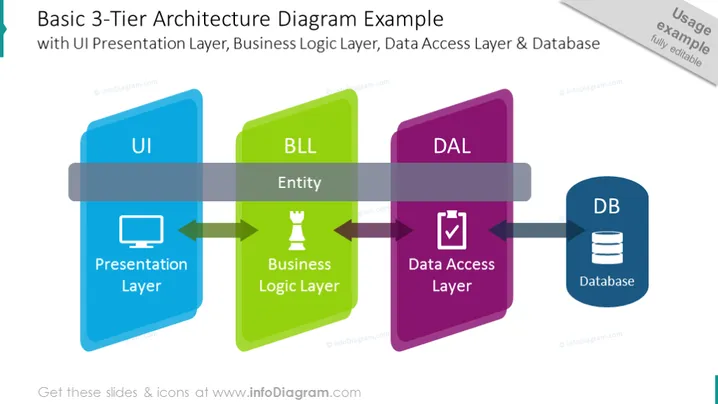
Die Folie präsentiert einen Überblick über ein einfaches 3-Schichten-Architekturdiagramm mit seinen drei Hauptkomponenten: UI-Präsentationsschicht, Business-Logik-Schicht (BLL) und Datenzugriffsschicht (DAL), die zu einer Datenbank (DB) führen. Die UI, in Blau dargestellt, repräsentiert die Präsentationsschicht, in der Benutzer interagieren, während die BLL, in Grün dargestellt, die Entität enthält, die die Business-Logik-Schicht darstellt, in der die Kernverarbeitung stattfindet. Die DAL in Lila verwaltet die Datenzugriffsschicht, die die Kommunikation mit der DB orchestriert, die in Dunkelblau dargestellt ist und die Datenspeicherkomponente symbolisiert.
Die visuelle Komposition verwendet lebendige, kontrastreiche Farben für jede Schicht: Blau, Grün und Lila, was hilft, jede architektonische Ebene klar zu unterscheiden. Die blockartigen Rechtecke und verbindenden Pfeile deuten auf einen Informationsfluss hin, während Symbole schnelle visuelle Hinweise auf die Funktion jeder Schicht geben.


