Your graphics add a nice touch to my presentations and I recently used them for one of my all-hands meetings. Your toolbox adds professionalism to my slides. Instead of using standard clipart.
Claude Jones, Director of Engineer, @Walmartlabs, USA
Your graphics add a nice touch to my presentations and I recently used them for one of my all-hands meetings. Your toolbox adds professionalism to my slides. Instead of using standard clipart.
Claude Jones, Director of Engineer, @Walmartlabs, USA
I needed a fresh look at some of my slides. I've tried to find a way to create a paintbrush effect, to underline, accentuate, add some color and the handwritten markers were just the things. Very easy to use, easy to size, change the color. It was an affordable, perfect solution and I'm happy to recommend it.
Anonymous, US
The crisp, clean look of the graphics, and the fact that it allowed me to easily edit and change the colors to match the template was my main reason for purchasing them.
Brandie Jenkins, E-learning Developer, USA
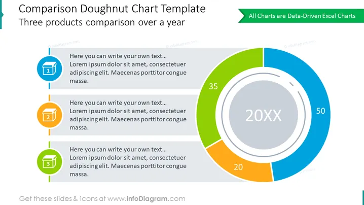
Diese PowerPoint-Folie präsentiert eine "Vergleich Donut-Diagramm Vorlage", die dazu entworfen wurde, einen Vergleich von drei Produkten über ein Jahr darzustellen. Jedes Produkt hat ein entsprechendes Textfeld, in das erläuternder Text eingefügt werden kann. Die Textbeispiele beginnen mit "Hier können Sie Ihren eigenen Text schreiben..." gefolgt von Platzhaltertext "Lorem ipsum dolor sit amet, consectetuer adipiscing elit. Maecenas porttitor congue massa," was darauf hinweist, dass der Präsentierende es mit relevantem Kontext zum jeweiligen Produkt ersetzen sollte.
Das Gesamtbild der Folie ist modern und professionell, mit einem klaren Kontrast zwischen der visuellen Datenrepräsentation und den textlichen Informationen. Die Farbcodierung und Nummerierung bieten eine einfache Möglichkeit, auf die Details jedes Produkts und die entsprechenden Daten im Diagramm zu verweisen.


