Your graphics add a nice touch to my presentations and I recently used them for one of my all-hands meetings. Your toolbox adds professionalism to my slides. Instead of using standard clipart.
Claude Jones, Director of Engineer, @Walmartlabs, USA
Your graphics add a nice touch to my presentations and I recently used them for one of my all-hands meetings. Your toolbox adds professionalism to my slides. Instead of using standard clipart.
Claude Jones, Director of Engineer, @Walmartlabs, USA
I needed a fresh look at some of my slides. I've tried to find a way to create a paintbrush effect, to underline, accentuate, add some color and the handwritten markers were just the things. Very easy to use, easy to size, change the color. It was an affordable, perfect solution and I'm happy to recommend it.
Anonymous, US
The crisp, clean look of the graphics, and the fact that it allowed me to easily edit and change the colors to match the template was my main reason for purchasing them.
Brandie Jenkins, E-learning Developer, USA
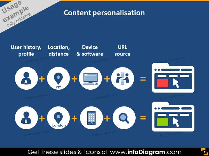
The slide is about "Content personalisation," illustrating how different data points such as user history/profile, location/distance, device & software, and URL source combine to create personalized web content for different users. User A's data, symbolized by a person icon and a location (NY), combined with a computer and a network symbol, results in a specific web layout. User B's data, similar but with a London location and a mobile phone icon, yields a different web layout.
The slide has a clean, modern look with a balanced layout of icons and text, designed to convey the concept of content personalisation through user data. The use of color is limited to blue, orange, and white, which stands out against the dark background.


