Your graphics add a nice touch to my presentations and I recently used them for one of my all-hands meetings. Your toolbox adds professionalism to my slides. Instead of using standard clipart.
Claude Jones, Director of Engineer, @Walmartlabs, USA
Your graphics add a nice touch to my presentations and I recently used them for one of my all-hands meetings. Your toolbox adds professionalism to my slides. Instead of using standard clipart.
Claude Jones, Director of Engineer, @Walmartlabs, USA
I needed a fresh look at some of my slides. I've tried to find a way to create a paintbrush effect, to underline, accentuate, add some color and the handwritten markers were just the things. Very easy to use, easy to size, change the color. It was an affordable, perfect solution and I'm happy to recommend it.
Anonymous, US
The crisp, clean look of the graphics, and the fact that it allowed me to easily edit and change the colors to match the template was my main reason for purchasing them.
Brandie Jenkins, E-learning Developer, USA
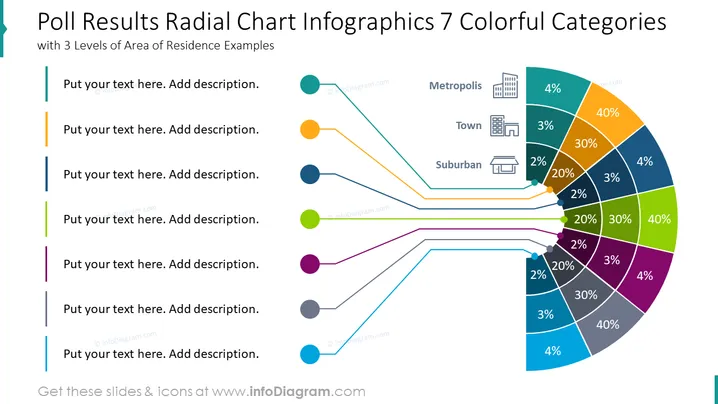
This slide illustrates the results of a poll in the form of a radial chart infographic, segmented into seven colorful categories associated with types of areas of residence. Each segment of the chart represents a different locality type such as Metropolis, Town, and Suburban, with corresponding percentages indicating the poll outcomes. Accompanying text boxes to the left are placeholder areas for additional descriptions to contextualize the data points, which tie back to the central chart through color-coded lines.
The slide has a clean, professional appearance with a well-organized layout that effectively communicates the data through both color and text. The distinct icons and percentages assist in quick comprehension of the information.


