Your graphics add a nice touch to my presentations and I recently used them for one of my all-hands meetings. Your toolbox adds professionalism to my slides. Instead of using standard clipart.
Claude Jones, Director of Engineer, @Walmartlabs, USA
Your graphics add a nice touch to my presentations and I recently used them for one of my all-hands meetings. Your toolbox adds professionalism to my slides. Instead of using standard clipart.
Claude Jones, Director of Engineer, @Walmartlabs, USA
I needed a fresh look at some of my slides. I've tried to find a way to create a paintbrush effect, to underline, accentuate, add some color and the handwritten markers were just the things. Very easy to use, easy to size, change the color. It was an affordable, perfect solution and I'm happy to recommend it.
Anonymous, US
The crisp, clean look of the graphics, and the fact that it allowed me to easily edit and change the colors to match the template was my main reason for purchasing them.
Brandie Jenkins, E-learning Developer, USA
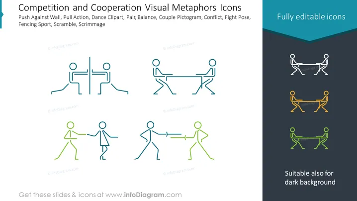
The PowerPoint slide is titled "Competition and Cooperation Visual Metaphors Icons" and showcases a series of stylized icons. These icons include images that represent various concepts related to competition and cooperation. There's an icon depicting a push against a wall, symbolizing an intense challenge or obstruction. Another shows figures engaged in a pulling action, which could represent teamwork or a tug-of-war scenario, implying competition or collaboration. A dance clipart icon likely represents coordination and unity. A pair balanced against each other signifies equilibrium or opposing forces. Couple pictograms could symbolize partnership or rivalry. The conflict icon is straightforward, depicting opposition, while the fight pose suggests aggression or confrontation. Finally, the fencing sport icon illustrates strategic competition, and scramble and scrimmage icons may refer to chaotic or strategic competitive interactions.
The slide has a simple yet engaging design, with a diagonal split that provides a visual contrast and focuses attention on the versatility of the icons. The icons are cleanly designed and convey their respective messages without clutter or unnecessary detail.


