Your graphics add a nice touch to my presentations and I recently used them for one of my all-hands meetings. Your toolbox adds professionalism to my slides. Instead of using standard clipart.
Claude Jones, Director of Engineer, @Walmartlabs, USA
Your graphics add a nice touch to my presentations and I recently used them for one of my all-hands meetings. Your toolbox adds professionalism to my slides. Instead of using standard clipart.
Claude Jones, Director of Engineer, @Walmartlabs, USA
I needed a fresh look at some of my slides. I've tried to find a way to create a paintbrush effect, to underline, accentuate, add some color and the handwritten markers were just the things. Very easy to use, easy to size, change the color. It was an affordable, perfect solution and I'm happy to recommend it.
Anonymous, US
The crisp, clean look of the graphics, and the fact that it allowed me to easily edit and change the colors to match the template was my main reason for purchasing them.
Brandie Jenkins, E-learning Developer, USA
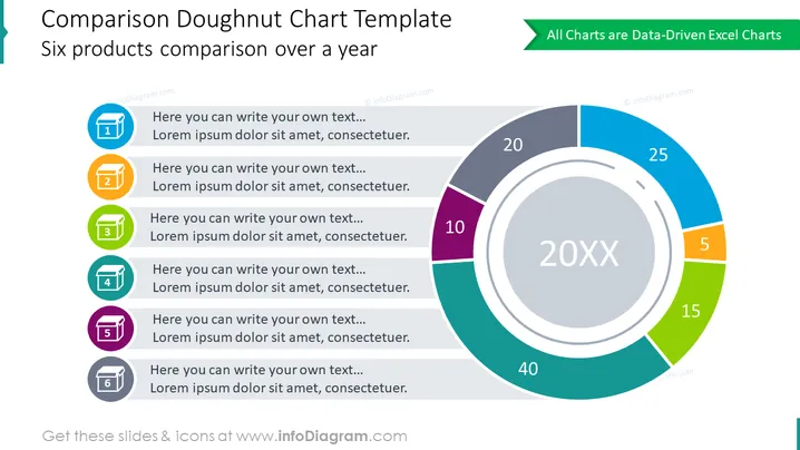
The slide provides a visual and textual comparison of six products over a year using a doughnut chart format. Each segment of the doughnut chart corresponds to a different product, visually represented with distinct colors and numeric values indicating performance metrics or quantities. Accompanying each colored segment is a numbered list (from 1 to 6) with space provided for custom text, where details or descriptions of each product or data category can be added to complement the chart data.
The slide has a clean, modern look with a mostly blue and gray color palette, accented with vibrant colors for each chart segment. The design is minimalistic, focusing on clarity and readability.


