Your graphics add a nice touch to my presentations and I recently used them for one of my all-hands meetings. Your toolbox adds professionalism to my slides. Instead of using standard clipart.
Claude Jones, Director of Engineer, @Walmartlabs, USA
Your graphics add a nice touch to my presentations and I recently used them for one of my all-hands meetings. Your toolbox adds professionalism to my slides. Instead of using standard clipart.
Claude Jones, Director of Engineer, @Walmartlabs, USA
I needed a fresh look at some of my slides. I've tried to find a way to create a paintbrush effect, to underline, accentuate, add some color and the handwritten markers were just the things. Very easy to use, easy to size, change the color. It was an affordable, perfect solution and I'm happy to recommend it.
Anonymous, US
The crisp, clean look of the graphics, and the fact that it allowed me to easily edit and change the colors to match the template was my main reason for purchasing them.
Brandie Jenkins, E-learning Developer, USA
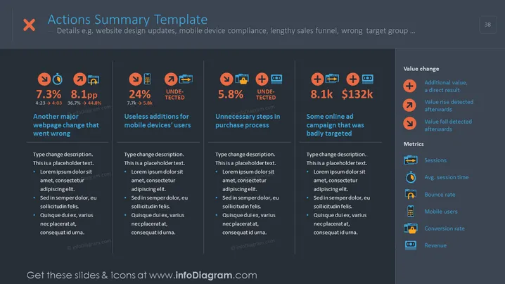
The slide titled "Actions Summary Template" seems to involve a business or analytic report summarizing various performance metrics and outcomes. The contents include declines in metrics with "7.3%" and "8.1pp," identified issues such as "Another major webpage change that went wrong" and "Useless additions for mobile devices' users," as well as an "Unnecessary steps in purchase process." There's a positive performance highlight with "Some online ad campaign that was badly targeted" showing an increase figure "8.1k" and monetary gain "$132k." Additionally, it lists "Value change" indicators and "Metrics" which include sessions, average session time, bounce rate, mobile users, conversion rate, and revenue.
The slide has a clean, modern aesthetic with a clear, structured layout conducive to summarizing detailed analytical data in a visually digestible format.


